A logo is something that looks simple and easy on the surface, but the more you think about it, the more challenging it gets. It’s like there are so many options out there and it can seem that you like all sorts of logos that have nothing in common. This is why coming up and designing a new logo can be a challenge. To that end, we will go over some general design philosophy tips that might help you with these struggles.
Make Multiple Options

Very often you will have multiple ideas for a logo, and those might not be compatible with one another. So, feel free to create multiple options and see which one fits better for that line of business. You can then eliminate those that you don’t like or if you feel that they don’t work, and maybe alter the options you do like to make them even better. There are various concepts that you can play around with, and you can ask other co-workers how they feel about the options you presented.
Imagine How It Will Look on Different Items
One trick that might help you with choosing your creative direction is to visualize how the logo would look on a different surface. Companies put their logo on the website, mugs, t-shirts, pens, or other promotional materials. These are all different surfaces and the logo might get elongated or curved in the process. Therefore you should try to go with a design that kind of works in all of those different situations.
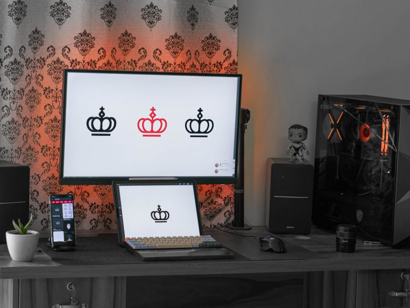
Literal Representation
There are lots of symbols or icons that we use to denote certain terms, categories, or simply to convey a message. This allows you to add icons as a part of the logo design. If it’s eco-friendly add a leaf if it’s about energy add lightning if it’s about creative work add a lightbulb. This icon can represent a product or simply a brand name, both are a good fit, and it’s something people go with these days. Think of Windows and Apple. Their logo is a window and an apple.
Target Audience

The audience is another important factor that will dictate the theme of your logo. If it’s for kids you might want something a bit goofy and cartoonish. If it’s about health care or finance it needs to be serious and maybe represent stability. This can also dictate the colors you need to use, as they are associated with certain feelings. Pink is used for sweets, yellow for bakery, brown for chocolate, etc. Meaning, a lot of the things you tend to think about are already predetermined by these factors.
Leverage Empty Space
Finally, whatever you design needs to grab attention or be in focus. This is why empty space is really important when it comes to logo design. The fewer details the better as it will allow more people to recognize the logo even from a distance.